Project 4: Your Life on the Big Screen
Materials: Pencil, Paper, IPad, Sketchbook App
Vocabulary: Composition, Unity, Digital Art, Space, Typography
First Day: Make a list of things that describes you, Create a theme/main idea of your movie, View & Discuss Examples
Second Day: Begin sketching movie poster ideas, Add color if time
Third day: Tools to creating a digital drawing, Illustrate in Sketchbook App
Fourth day: Blog


7 Elements of a Great Movie Poster Design
1. ATTENTION – JUMP OUT FROM THE WALL.
If there’s one simple sales formula that everyone in a performance-based position should know, it’s AIDA. The four-step formula – attention, interest, desire, and action – has been used as the basis of thousands of successful movie advertising campaigns.
The first step, and the one most important for designers, is attention – grabbing the attention of passers-by and encouraging them to look.
This doesn’t have to be achieved with provocative pictures or flashy graphics, although given their advantage at grabbing attention, it’s no wonder Hollywood’s turned to them en masse.
By using the film’s characters or a major plot point, designers can establish some level of plot while still gaining the attention of anyone that views the poster.
2. ICONOGRAPHY – SHOWING WITHOUT TELLING.
The most effective movie posters are iconic, presenting the themes in the film without resorting to flat out saying what it’s about.
They use imagery, whether a close-up of a character or item that’s a major plot point, or a simple graphic, to establish the film’s plot. Combined with an eye-grabbing design, this can be an incredibly effective way to gain attention and create interest at once.
3. INTEREST – CREATE AN INCENTIVE TO SEE THE FILM.
When using icons and more abstract imagery doesn’t work with your film – say, for example, it’s a serious drama or a thriller that can’t be explained with iconography – using an image that provides viewers with an idea of the story is a great idea.
Many of the best modern film posters use pictures that put the viewer in the middle of a scene from the film, creating tension and a major incentive.
The incentive is that in order to resolve the situation, the person looking at the poster needs to see the film and find out what happens.
This type of design strategy tends to work best with films that cover unrealistic, fantasy-type events, particularly those that deal with the supernatural or psychological.
Since it’s hard to offer insight for this type of story using icons and simple colors, a still from the film can work wonders.
4. APPEAL – CREATE DESIRE WITH FANS AND NON-FANS ALIKE.
With film studios cranking out comic book adaptations at a rapid pace, it’s the ‘true fans’ that end up last in the marketing line.
Studios can rely on them to see their new releases regardless of its review coverage or promotional materials, since chances are fairly strong they’re already aware of it. Great film posters, particularly those for adaptations, use this dual appeal to enhance their advertising.
Compare this type of promotional poster to the marketing materials used for films that draw appeal from the involvement of a certain actor.
Since fans’ ties with actors are generally weaker than those with directors or producers, their names usually appear in large print to grab attention. The stronger the audience’s bond, the less important it becomes to highlight features that appeal to current fans.
5. STYLE – A LOOK THAT’S CONSISTENT WITH THE FILM.
Whether you’re marketing an art film or a blockbuster, style matters. Some of the most memorable film posters out there have used bold, unique artistic styles to their advantage.
What separates these posters from their ineffective art-for-art’s-sake rivals is that they’re consistent with style, in both the movie’s promotional materials and throughout the film itself.
It’s accurate too, using the same type of stylized imagery as the film itself. This consistency means that it isn’t just a great theater-based marketing tool, but a recognizable image for DVD and other releases.
6. LASTING APPEAL – A LOOK THAT SUITS OTHER FORMATS.
Here’s the danger in getting too ‘arty’ and delicate with your film poster: it’s eventually, after release and theater shows, going to be shrunk to a fraction of its original size for the DVD release.
While a growing number of films now use different designs for their DVD cover than their in-theater promo posters, most of the classics and high-budget blockbusters still use the same poster for both.
This means that your imagery, your titles, and your major points of interest need to be just as visible on a small DVD case as they are on a giant movie poster.
7. RECOGNIZABILITY – IF IT’S A SEQUEL, MAKE IT OBVIOUS.
From time to time, the entire box office seems to be made up of sequels.
There’s a good reason for it too – some of the most financially dependable films are sequels to successful franchises.
From films that dominated both the commercial world and the awards scene to purely commercial releases, few films can guarantee studios income like a good sequel.
That’s why sequel posters tend to be highly related to the first release, generally with a giant title in the top third of the canvas and instantly recognizable imagery throughout it.
Blog: Written exclusively for WDD by Mathew Carpenter. He is an 18-year-old business owner and entrepreneur from Sydney, Australia. http://www.webdesignerdepot.com/2011/02/7-elements-of-a-great-movie-poster-design/
Now it's your turn! Come up with your: Characters, Setting, Plot, and Theme/Main Idea
Project 3
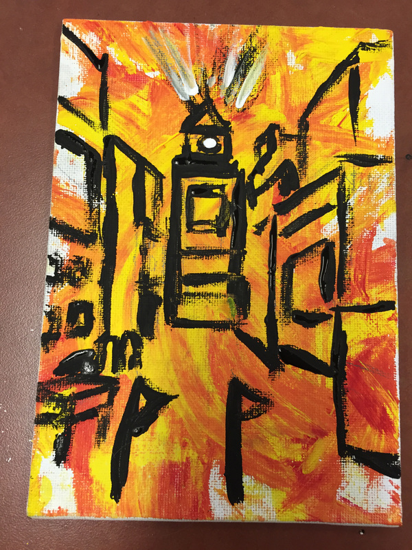
New Years Around the World Perspective Drawing
Materials: Pencil, Ruler, Tempera paint, Cardboard piece, Canvas Paper
Vocabulary: Perspecive, Line, Space, Warm and Cool Colors
First Day: Read about Action Painting and Prep Canvas
Second Day: Perspective Assignment and Paint on canvas using cardboard and black paint
Third day: Blog Post


|

|
Action Painting emphasizes the process of making art, often through a variety of techniques that include dripping, dabbing, smearing, and even flinging paint on to the surface of the canvas. These energetic techniques depend on broad gestures directed by the artist's sense of control interacting with chance or random occurrences. For this reason, Action Painting is also referred to as Gestural Abstraction.
The artists and the various techniques are associated with the movement Abstract Expressionism and The New York School of the late 1940s, 1950s and 1960s (for example, Jackson Pollock, Willem de Kooning and Franz Kline).
The term "action painting" was invented by the critic Harold Rosenberg and appeared for the first time in his article "American Action Painters" (ArtNews, December 1952).

Jackson Pollock 'Convergence,' 1952
|

Williem de Kooning 'Asheville,' 1948
|
New Years Traditions
http://www.infoplease.com/spot/newyearcelebrations.html
Auld Lang Syne The most commonly sung song for English-speakers on New Year's eve, "Auld Lang Syne" is an old Scottish song that was first published by the poet Robert Burns in the 1796 edition of the book, Scots Musical Museum. Burns transcribed it (and made some refinements to the lyrics) after he heard it sung by an old man from the Ayrshire area of Scotland, Burns's homeland.
It is often remarked that "Auld Lang Syne" is one of the most popular songs that nobody knows the lyrics to. "Auld Lang Syne" literally translates as "old long since" and means "times gone by." The song asks whether old friends and times will be forgotten and promises to remember people of the past with fondness, "For auld lang syne, we'll tak a cup o' kindness yet."
But it was bandleader Guy Lombardo, and not Robert Burns, who popularized the song and turned it into a New Year's tradition. Lombardo first heard "Auld Lang Syne" in his hometown of London, Ontario, where it was sung by Scottish immigrants. When he and his brothers formed the famous dance band, Guy Lombardo and His Royal Canadians, the song became one of their standards. Lombardo played the song at midnight at a New Year's eve party at the Roosevelt Hotel in New York City in 1929, and a tradition was born.
After that, Lombardo's version of the song was played every New Year's eve from the 1930s until 1976 at the Waldorf Astoria. In the first years it was broadcast on radio, and then on television. The song became such a New Year's tradition that "Life magazine wrote that if Lombardo failed to play 'Auld Lang Syne,' the American public would not believe that the new year had really arrived."
Hogmanay (Scotland)
The birthplace of "Auld Lang Syne" is also the home of Hogmanay (hog-mah-NAY), the rousing Scottish New Year's celebration (the origins of the name are obscure). One of the traditions is "first-footing." Shortly after midnight on New Year's eve, neighbors pay visits to each other and impart New Year's wishes. Traditionally, First foots used to bring along a gift of coal for the fire, or shortbread. The Edinburgh Hogmanay celebration is the largest in the country, and consists of an all-night street party.
Oshogatsu (Japan)
The new year is the most important holiday in Japan, and is a symbol of renewal. In December, various Bonenkai or "forget-the-year parties" are held to bid farewell to the problems and concerns of the past year and prepare for a new beginning. Misunderstandings and grudges are forgiven and houses are scrubbed. At midnight on Dec. 31, Buddhist temples strike their gongs 108 times, in a effort to expel 108 types of human weakness. New Year's day itself is a day of joy and no work is to be done. Children receive otoshidamas, small gifts with money inside. Sending New Year's cards is a popular tradition—if postmarked by a certain date, the Japanese post office guarantees delivery of all New Year's cards on Jan. 1.
Spain
The Spanish ritual on New Year's eve is to eat twelve grapes at midnight. The tradition is meant to secure twelve happy months in the coming year. The Netherlands The Dutch burn bonfires of Christmas trees on the street and launch fireworks. The fires are meant to purge the old and welcome the new.
Greece
In Greece, New Year's day is also the Festival of St. Basil, one of the founders of the Greek Orthodox Church. One of the traditional foods served is Vassilopitta, or St Basil's cake. A silver or gold coin is baked inside the cake. Whoever finds the coin in their piece of cake will be especially lucky during the coming year.
United States
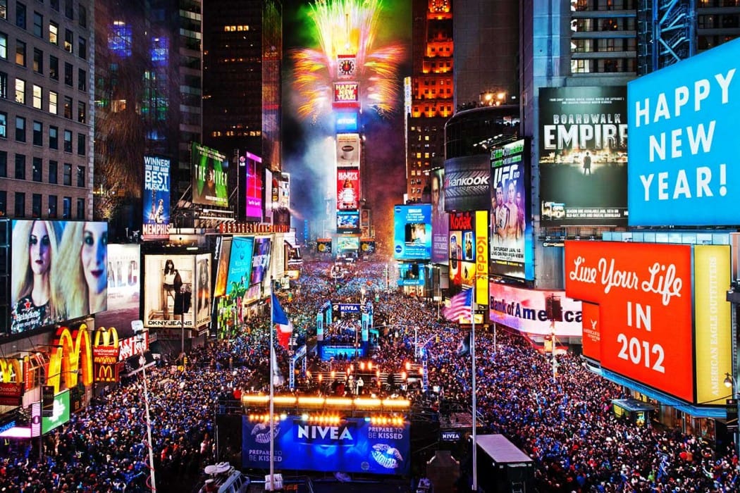
Probably the most famous tradition in the United States is the dropping of the New Year ball in Times Square, New York City, at 11:59 P.M. Thousands gather to watch the ball make its one-minute descent, arriving exactly at midnight. The tradition first began in 1907. The original ball was made of iron and wood; the current ball is made of Waterford Crystal, weighs 1,070 pounds, and is six feet in diameter. A traditional southern New Year's dish is Hoppin' John—black eyed peas and ham hocks. An old saying goes, "Eat peas on New Year's day to have plenty of everything the rest of the year."
Another American tradition is the Rose Bowl in Pasadena, California. The Tournament of Roses parade that precedes the football game on New Year's day is made up of elaborate and inventive floats. The first parade was held in 1886.
Widely Observed New Year Symbols and Traditions
Resolutions: It is believed that the Babylonians were the first to make New Year's resolutions, and people all over the world have been breaking them ever since. The early Christians believed the first day of the new year should be spent reflecting on past mistakes and resolving to improve oneself in the new year.
Fireworks: Noisemaking and fireworks on New Year's eve is believed to have originated in ancient times, when noise and fire were thought to dispel evil spirits and bring good luck. The Chinese are credited with inventing fireworks and use them to spectacular effect in their New Year's celebrations.


|
Scotland - One Point Perspective
Japan - One Point Perspective Spain - Two Point Perspective Greece - Two Point Perspective United States - One Point Perspective |
Project 1
Sign Language Hand Drawings
Materials: Pencil, Sign Language Alphabet Sheet, 6" x 18" Paper
Vocabulary: Contour line, Line, Form, Value, Typography
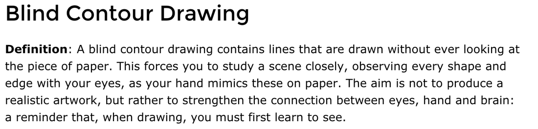
First Day: Blind Contour Drawings, Contour Line Drawings of Hands (ART)
Second Day: First draft of hands spelling your word
Third Day: Final Draft
Due: Week of October 3rd


the style, arrangement, or appearance of printed letters on a page.

Choose a font to replicate on: dafont.com
Posting Final Project:Block A: kidblog.org/douglas-art-8a
Block B: kidblog.org/douglas-art-8b Block C: kidblog.org/douglas-art-8c Block D: kidblog.org/douglas-art-8d Type in your name: (First & Last) Password: douglasart (please change your password, write it down, let Miss Murphy know your new password)
2. What is the meaning of a contour line drawing? 3. What was the most challenging part of the assignment? 4. What word did you choose and why did you choose that word? Project 3
|
Materials: Plaster of Paris, Tempera Paint
Vocabulary: Shape, Symmetry, Complimentary Colors
Vocabulary: Shape, Symmetry, Complimentary Colors
Day 1: Read about the culture of Day of the Dead and design your mask.
Day 2: Sketch a draft of our masks using symmetry.
Day 3: Create and Paint our design on our masks.
Day 2: Sketch a draft of our masks using symmetry.
Day 3: Create and Paint our design on our masks.
